Thomas Peng Brand · Packaging · Print · Web — Toronto

Ier service — Amuse-bouche · one precise bite, to begin

HearingLife

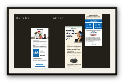
A single eblast, redrawn — new hierarchy, one clear action, and a more legible path to a younger audience.
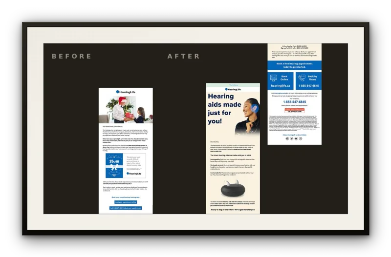
Framed before-and-after of the HearingLife eblast — the dense original layout beside the redesign, which leads with “Hearing aids made just for you” and closes on a single blue booking module.
HearingLife · Email Modernization

Ingrédients · Ingredients

  • One core eblast, documented before and after
  • A single headline — “Hearing aids made just for you”
  • One unambiguous booking call to action
  • Substrate — the inbox, desktop rendering

Service — Design & production

Accord · Pairing

Pairs with restraint — hierarchy stripped back to its essential job.

An intervention precise rather than sweeping: contemporary without erasing the trust the brand earned over decades.

Commander ce service — plate the full case study

HearingLife is a long-established Canadian hearing-health provider whose email programme had, over time, drifted toward the habits of an older audience: dense layouts, competing priorities, and a tone that leaned on familiarity rather than invitation.

The brief was deliberately narrow — modernize the email’s voice and format for a younger demographic without surrendering the brand’s authority. The response was equally focused: a single, documented before-and-after redesign of a core eblast.

Approach

The original layout carried the marks of email built for a different era: cluttered hierarchy, no clear resting point for the eye, and a call to action buried among competing messages. The redesign stripped the composition back to its essential job — bring the right person to a booking.

A clean, legible structure replaced the dated format, centred on a single headline — “Hearing aids made just for you” — and one unambiguous booking call to action. The intervention was precise rather than sweeping: every decision served the task of making the email feel contemporary without erasing the trust the brand had earned over decades.

L’addition · Outcome

A production-ready direction — a documented, restrained modernization showing how HearingLife’s email could reach a broader audience while holding its authority.
Retour au menu · Back to the menu

IIe service — Entrée · a mark to open

Cyberus Systems

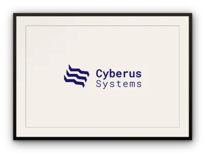
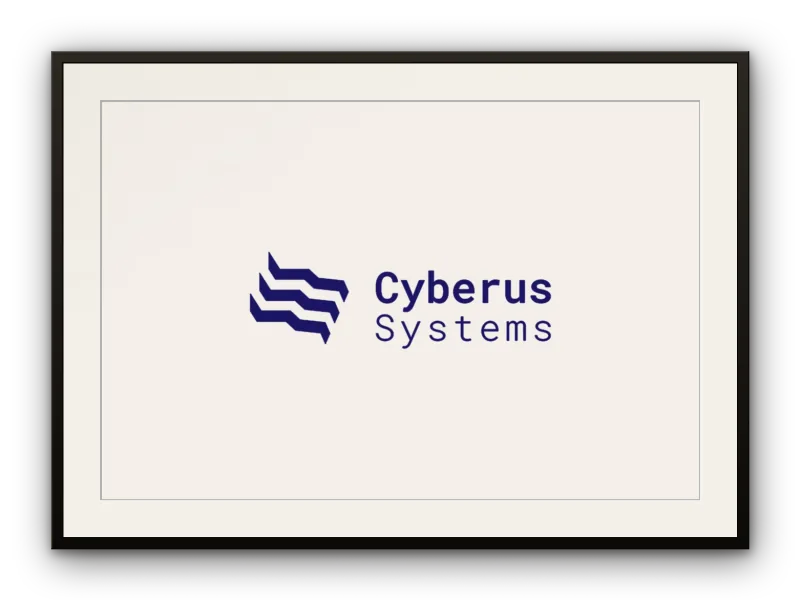
Three layered forms in deep navy — a mark that reads as both signal and structure.

Framed print of the Cyberus Systems identity — three stair-stepped chevron bands in deep navy beside the two-line “Cyberus Systems” wordmark, set on a warm off-white field.
Cyberus Systems · Brand Identity

Ingrédients · Ingredients

  • Symbol — three parallel chevron bands, stair-stepped downward
  • Round-cornered geometric wordmark, two-line stack
  • Identity before descriptor — “Systems” at a lighter optical weight
  • Deep navy, unifying symbol and type
Palette

Service — Design & production

Accord · Pairing

Pairs with geometry — equal weight, equal spacing, dynamism kept disciplined.

Vigilance and technical depth signalled without padlocks or the usual clichés.

Commander ce service — plate the full case study

Cyberus Systems is a cyber-security company, and its identity had to hold two ideas at once — protection, and the constant movement of data. The mark answers with a stacked symbol of three chevron-like bands, each offset from the last, set against a clean geometric wordmark: the symbol does the expressive work, the type grounds it with institutional weight.

The name folds the digital (cyber) into the mythological guardian (Cerberus), and the form follows — the layered bands read at once as signal waves, network layers, or shields in motion. For a security brand, legibility is the point: the mark signals vigilance and technical depth without falling back on padlocks or the usual clichés.

The Mark

The symbol is three parallel chevron bands, each stair-stepped downward to the left, generating cascading movement that never breaks into chaos. The geometry is precise — equal weight, equal spacing — which keeps the dynamism disciplined. That tension between motion and order is the mark’s central idea.

The wordmark is set in a round-cornered geometric sans that echoes the softened cuts in the symbol. Deep navy unifies both: authoritative without aggression, technical without coldness. “Systems” sits flush beneath “Cyberus” at a lighter optical weight — identity before descriptor — while the two-line stack mirrors the layered logic of the icon itself.

L’addition · Outcome

A mark restrained enough to anchor a wider identity — technically rigorous without losing its edge.

Retour au menu · Back to the menu

IIIe service — Plat principal · the main — a full system

Willo

A cannabis edibles brand built from nothing — identity, packaging, and a direct-to-consumer presence unified into a single, coherent voice.

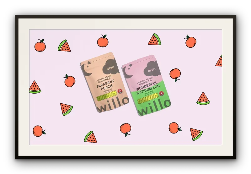
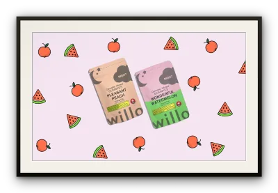
Framed print of the Willo NIGHT packaging line — “Pleasant Peach” and “Wonderful Watermelon” gummy pouches on a pale pink field patterned with hand-drawn peaches and watermelon slices, the rounded willo logotype running along each pouch.
Willo · Brand Identity · Packaging

Ingrédients · Ingredients

  • Logo, colour palette, typography — every touchpoint from the ground up
  • Packaging system across the SKU line, flavour character left to breathe
  • Flavour-led SKU naming — Pleasant Peach, Wonderful Watermelon
  • NIGHT 200mg line — the same brand DNA at a higher potency
  • E-commerce site with SEO as a structural consideration; email, SMS, social in one register

Service — Design & production

Accord · Pairing

Pairs with systems thinking — one voice held from first impression through to purchase.

Friendly and approachable without surrendering the premium quality signal that justified its place on the shelf.

Commander ce service — plate the full case study

When Willo launched in March 2020, the legal cannabis edibles market was crowded with brands that spoke almost exclusively to experienced consumers: hard-edged aesthetics, clinical copy, and a singular focus on potency over pleasure. The brief was to build something different — a brand that could welcome newer consumers who cared about taste and quality as much as effect.

Leading creative direction alongside marketing and business strategy, Thomas conceived and executed every touchpoint from the ground up: logo, colour palette, typography, packaging system, e-commerce website, SEO, email, and social. The brand launched at the start of the pandemic — a moment when direct-to-consumer digital infrastructure was not a channel among many, it was the entire channel.

Brand & Identity

The central problem was legibility in a category that had defaulted to either clinical minimalism or aggressive recreational energy. Willo needed to read as friendly and approachable without surrendering the premium quality signal that justified its place on the shelf.

The result was an identity built around soft, rounded letterforms and flavour-led colour — a visual language that could speak credibly to someone buying a THC gummy for the first time without condescending to them. The SKU names follow the same logic: Pleasant Peach, Wonderful Watermelon — flavour-forward, sensory, genuinely inviting. The NIGHT 200mg line extends the system toward a more considered register: the same brand DNA at a higher potency.

Packaging System

Packaging was designed as a system, not a sequence of individual decisions. Each SKU had to feel unmistakably Willo while letting its flavour character breathe, so the line could expand without fragmenting the brand.

With no existing equity to trade on, the packaging carried the full weight of first impression — communicating taste, quality, and trust to a consumer who was, in many cases, buying a cannabis edible for the first time.

Digital & Growth

The e-commerce site was the entire storefront, built with SEO as a structural consideration from the start rather than a post-launch afterthought — a deliberate choice in a category where paid advertising remained largely restricted.

Awareness was built through direct channels: SMS, email, social, and contests that rewarded early customers and generated word of mouth. Each channel held the same voice and register, keeping the brand consistent from first impression through to purchase.

L’addition · Outcome

Willo grew to over $50,000 in monthly sales — built with no legacy brand, few conventional advertising channels, and a launch that landed in the same month a global pandemic began.

Retour au menu · Back to the menu

IVe service — Pièce de résistance · the showpiece

BMW

An embedded-video-screen mailer for the 7 Series — and the retouching standard behind BMW’s marketing imagery.

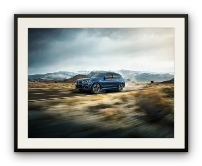
Framed retouched BMW image — a blue vehicle at speed on a mountain highway, foreground brush blurred with motion, snow-capped peaks and storm light held in balance behind it.
BMW · Direct Mail · Automotive Retouching

Ingrédients · Ingredients

  • A direct mailer built around an embedded video screen
  • Printed cards staged so features reveal in sequence
  • Format, trim, fold, and screen placement resolved together
  • Retouching — paint response, panel geometry, reflections, ambient light
  • Substrate — the hand, then the recycling bin it must outlast

Service — Design & production

Accord · Pairing

Pairs with production craft — an object resolved as it would feel in the hand.

Every image finished to the level the 7 Series is sold on, at the resolution large-format work demands.

Commander ce service — plate the full case study

BMW’s 7 Series team needed a new way to put the car in a prospect’s hands before they ever reached a showroom. The brief was open: find a direct-mail format worth opening, and worth keeping.

That answer was a mailer built around an embedded video screen, with printed cards staged so the vehicle’s new features reveal themselves as the piece is handled. But the engagement ran wider than one object: it also covered the image retouching behind BMW’s marketing, promotional, and social materials — the everyday imagery the brand puts in front of people, finished to the same standard as the car.

The Format

A direct-mail piece competes with the recycling bin. Embedding a working video screen — rather than printing another fold-out — was a bet that a 7 Series prospect would stop for something that behaved like an object, not a brochure.

The printed cards were staged around the screen so the vehicle’s features unfolded in sequence as the recipient moved through the piece. Format, trim, fold, and screen placement were resolved together, the piece always considered as it would feel in the hand.

Retouching

Automotive photography never arrives press-ready. Across BMW’s marketing, promotional, and social imagery, each shot was retouched in post — paint response, panel geometry, reflections, ambient light — so the finished image holds against the brand’s own production standard, at the resolution large-format work demands.

The work moved between studio and environmental frames, and between channels and formats, but the discipline stayed the same: keep every image consistent with BMW’s established visual language, and let nothing pull the eye from the vehicle.

L’addition · Outcome

Two sides of one standard — a mailer resolved as a single object, and a body of retouched imagery running across BMW’s channels, each finished to the level the 7 Series is sold on.

Retour au menu · Back to the menu

Ve service — Fromage · the course with rules

Allstate

Press-ready direct mail and desktop email, built to a regulated national brand’s specifications alongside its creative team.

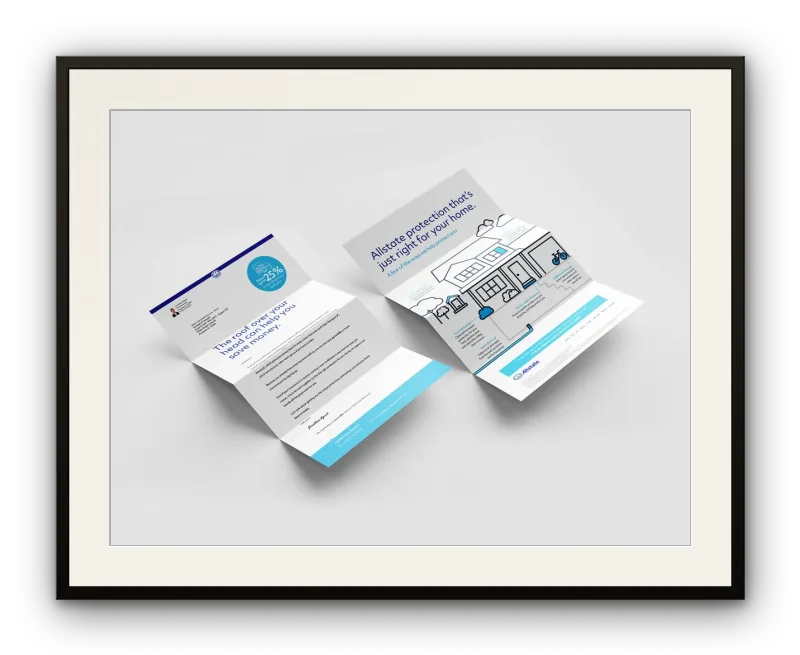
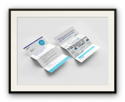
Framed print of two unfolded Allstate direct-mail letterfolds — blue-and-white panels with an illustrated home, a 25% offer roundel, address block, and the Allstate footer bar, laid flat as press-ready pieces.
Allstate · Direct Mail · Email Production

Ingrédients · Ingredients

  • Desktop email layouts, held to rendering discipline
  • Direct-mail files prepared for press, high-volume operation
  • Bleed, colour values, safe zones — each constraint fixed
  • Someone else’s system, spoken fluently

Service — Design & production

Accord · Pairing

Pairs with rigour — this is the kind of work that doesn’t reward improvisation. Execution is the work.

The measure of success is plain: files that are correct, compliant, and ready.

Commander ce service — plate the full case study

Allstate’s materials reach policyholders at scale and carry the brand’s accountability with them, which makes production rigour non-negotiable. Working alongside Allstate’s creative team, the role was production-focused: build to spec, prepare for press, and make sure every file could move through the pipeline without revision.

This is the kind of work that doesn’t reward improvisation. Colour values, bleed, safe zones, email rendering — each constraint is fixed by the client, the printer, or the inbox. Execution is the work.

Production

The engagement covered two distinct production surfaces: desktop email layouts, and direct-mail files prepared for print. Email work required close attention to rendering discipline — clients impose structural constraints the visual design alone cannot guarantee, and a brand like Allstate demands consistency at every step. Print files asked for the same rigour in a different register: bleed, colour accuracy, and press-ready preparation aligned to a high-volume direct-mail operation.

Working inside an established creative team meant fluency in someone else’s system — adhering to brand guidelines already in place, matching file conventions already decided, and contributing output that could move forward without a handoff lag. The measure of success is plain: files that are correct, compliant, and ready.

L’addition · Outcome

A body of direct-mail and email assets delivered across multiple campaigns to Allstate’s standards — accurate, on-spec, and ready.

Retour au menu · Back to the menu

VIe service — Dessert · something warm, kept

Jotted

A scribble made deliberate — the energy of a thought caught mid-flight.

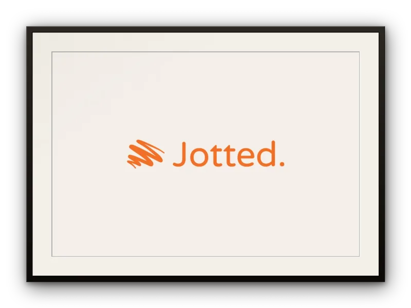
Framed print of the Jotted logotype — a loose, looping scribble mark in warm orange beside the rounded wordmark “Jotted”, closed with its terminal period, on a warm off-white field.
Jotted · Brand Identity

Ingrédients · Ingredients

  • Symbol — overlapping scribble-strokes, the trace the pen leaves
  • Humanist rounded wordmark — soft terminals, open apertures
  • The terminal period — quiet emphasis, the designer’s signature on the idea
  • A single warm orange, unifying mark and name
Palette

Service — Design & production

Accord · Pairing

Pairs with gesture — every loop slightly overruns the last, the way handwriting does.

The whole arc of an idea, from impulse to record — which is exactly what a notebook is for.

Commander ce service — plate the full case study

Jotted is a notebook and stationery brand, and its logotype had to feel like the thing it sells: the moment a thought gets written down. It holds two gestures in one breath — a loose, spiralling mark that reads as handwriting in motion, and a clean rounded wordmark that grounds it. The terminal period turns a fleeting note into something kept.

For a stationery brand, the mark earns its place by being about the act of writing rather than the product. The symbol is unfinished by design — a cascade of looping strokes that catch a thought before it settles — while the wordmark stays composed and assured. Together they run the whole arc of an idea, from impulse to record, which is exactly what a notebook is for.

The Mark

The symbol is a cluster of overlapping scribble-strokes in a single warm orange — not a tidy icon of a pen, but the trace the pen leaves. The looseness is deliberate; every loop slightly overruns the last, the way handwriting does when the mind moves faster than the hand.

The wordmark is set in a humanist rounded sans — soft terminals, open apertures, letterspacing generous enough to let the word breathe. The colour is identical to the symbol, unifying mark and name without a container or frame. The terminal period is the most considered choice here: it closes the word the way a period closes a sentence, and in a logotype reads as quiet emphasis — the designer’s signature on the idea.

L’addition · Outcome

A mark that captures the private moment of notation — confident, warm, and unmistakably its own.

Retour au menu · Back to the menu

VIIe service — Mignardises · small, to finish

soomoo

A mark whose softness is its argument.

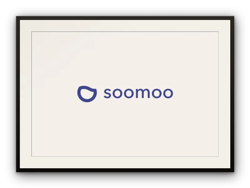
Framed print of the soomoo identity — an open, near-circular indigo stroke with a gentle break at the top, beside the lowercase “soomoo” wordmark in the same stroke weight.
soomoo · Brand Identity

Ingrédients · Ingredients

  • Icon — a single closed stroke, interrupted by a gentle break
  • Interior counter mirroring the outer form — a figure within a figure
  • Lowercase wordmark, matched stroke weight and corner radius
  • Medium-depth indigo-violet — quiet conviction
Palette

Service — Design & production

Accord · Pairing

Pairs with touch — rounded, tactile logic, the way a cup sits in the hand.

For something you hold while you slow down, restraint is the point.

Commander ce service — plate the full case study

soomoo is a drinkware brand — tea cups and tumblers — and its identity leans entirely on rounded, tactile logic, the way a cup sits in the hand. The icon is an open, slightly irregular oval with a notched interior: at once a vessel, a face, and a glyph. Paired with a lowercase wordmark in a geometric sans, the system reads warm and approachable without tipping into cute.

The doubled ‘oo’ at the centre of the name is part of the design — the letterforms echo the symbol’s circular grammar, and the lowercase keeps the brand from claiming an authority it doesn’t want. For something you hold while you slow down, restraint is the point.

The Mark

The symbol is a single closed stroke — near-circular, interrupted at the top by a gentle break that keeps it from reading as mere geometry. That gap is the detail that makes it feel alive: it implies openness, breath, a gesture held in balance. The interior counter mirrors the outer form, a figure within a figure that rewards a closer look.

Colour is a medium-depth indigo-violet, neither corporate nor casual — quiet conviction. The wordmark shares the symbol’s stroke weight and corner radius, a constraint that makes the pairing feel inevitable rather than assembled. Lowercase sets the register: a name spoken gently, not announced.

L’addition · Outcome

A mark that holds its character at any scale — intimate in small reproduction, assured at display size.

Retour au menu · Back to the menu

La Maison · About

Thomas Peng

Thomas Peng is a multidisciplinary designer based in Toronto, with fifteen years of practice across brand identity, packaging, print, web, and art direction. He works in English and French, for clients that range from emerging consumer brands to established national institutions.

The work moves between extremes of scale: a logo resolved at a few points, a full packaging system, a high-volume print programme held to a national brand’s specification. What stays constant is the disposition — find the right form for the problem, then execute it to a standard that survives contact with production.

Based in
Toronto, Canada
Languages
English / Français
Practice
Brand · Packaging · Print · Web
Contact
thomas@thomaspeng.ca

Selected clients — Willo · BMW · Allstate · HearingLife

Réservations · Contact

“Let’s make something worth keeping.”

Brand, packaging, print, and web — from a single mark to a full system. If the brief is defined and the standard is high, I’d like to hear about it.

thomas@thomaspeng.ca
Toronto, Canada English / Français Open to new projects