Thomas Peng

Brand · Packaging · Print · Web — TorontoMarque · Emballage · Imprimé · Web — Toronto

verso · français

Œuvres choisies

Une petite salle d’œuvres réfléchies.

Marque, emballage, imprimé & web — Thomas Peng, Toronto. Approchez-vous d’une pièce pour entrer dans toute son histoire.

Un seul livre, deux lectures — l’anglais en belle page, le français en fausse page, le travail cousu à travers la reliure. Chaque colonne, lue seule, traverse toute la salle.

thomas@thomaspeng.ca

recto · English

Selected Work

Thomas Peng

A small room of considered work.

Brand, packaging, print & web — Thomas Peng, Toronto. Step to any piece to enter its full story.

One book, two readings — English on the right-hand page, French on the left, the work stitched across the gutter. Either column, read alone, walks the whole room.

thomas@thomaspeng.ca

Selected Work · 3

Thomas Peng — Œuvres choisies

Selected Work — Willo

01 · 07

Willo

Willo · Brand Identity · Packaging
pl. 1 — Willo · Brand Identity · Packagingpl. 1 — Willo · Identité de marque · Emballage

verso · français

Identité de marque · Emballage · Commerce en ligne

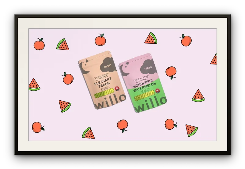
Une marque de comestibles au cannabis bâtie à partir de rien — identité, emballage et vente directe réunis en une seule voix cohérente.

Au lancement de Willo en mars 2020, le marché légal des comestibles au cannabis était saturé de marques qui s’adressaient presque exclusivement aux consommateurs aguerris : esthétique dure, ton clinique, obsession de la puissance au détriment du plaisir. Le mandat : bâtir autre chose — une marque capable d’accueillir de nouveaux consommateurs sensibles au goût et à la qualité autant qu’à l’effet.

À la direction de création, aux côtés de la stratégie marketing et d’affaires, Thomas a conçu et réalisé chaque point de contact depuis zéro : logo, palette, typographie, système d’emballage, site de commerce en ligne, référencement, courriel et réseaux sociaux. La marque a été lancée au début de la pandémie — un moment où l’infrastructure numérique de vente directe n’était pas un canal parmi d’autres, mais le canal tout entier.

Système d’emballage

L’emballage a été pensé comme un système, non comme une suite de décisions isolées. Chaque produit devait être immanquablement Willo tout en laissant respirer le caractère de sa saveur, pour que la gamme puisse s’étendre sans fragmenter la marque.

Résultat

Willo a dépassé 50 000 $ de ventes mensuelles — sans marque établie, presque sans publicité conventionnelle, et un lancement survenu le mois même où commençait une pandémie mondiale.

Rôle — Conception & production

recto · English

Brand Identity · Packaging · E-commerce

A cannabis edibles brand built from nothing — identity, packaging, and a direct-to-consumer presence unified into a single, coherent voice.

When Willo launched in March 2020, the legal cannabis edibles market was crowded with brands that spoke almost exclusively to experienced consumers: hard-edged aesthetics, clinical copy, and a singular focus on potency over pleasure. The brief was to build something different — a brand that could welcome newer consumers who cared about taste and quality as much as effect.

Leading creative direction alongside marketing and business strategy, Thomas conceived and executed every touchpoint from the ground up: logo, colour palette, typography, packaging system, e-commerce website, SEO, email, and social. The brand launched at the start of the pandemic — a moment when direct-to-consumer digital infrastructure was not a channel among many, it was the entire channel.

Packaging System

Packaging was designed as a system, not a sequence of individual decisions. Each SKU had to feel unmistakably Willo while letting its flavour character breathe, so the line could expand without fragmenting the brand.

Outcome

Willo grew to over $50,000 in monthly sales — built with no legacy brand, few conventional advertising channels, and a launch that landed in the same month a global pandemic began.

Role — Design & production

Willo · 5

Thomas Peng — Œuvres choisies

Selected Work — BMW

02 · 07

BMW

BMW · Direct Mail · Automotive Retouching
pl. 2 — BMW · Direct Mail · Automotive Retouchingpl. 2 — BMW · Publipostage · Retouche automobile

verso · français

Publipostage · Retouche · Imprimé

Un envoi à écran vidéo intégré pour la Série 7 — et le standard de retouche derrière l’imagerie marketing de BMW.

L’équipe de la Série 7 de BMW cherchait une nouvelle façon de mettre la voiture entre les mains d’un client potentiel avant même la salle de montre. Le mandat était ouvert : trouver un format de publipostage qui vaille la peine d’être ouvert — et d’être gardé.

La réponse : un envoi construit autour d’un écran vidéo intégré, avec des cartes imprimées disposées pour que les nouveaux équipements du véhicule se révèlent au fil de la manipulation. Mais l’engagement dépassait l’objet : il couvrait aussi la retouche des images marketing, promotionnelles et sociales de BMW — l’imagerie quotidienne de la marque, finie au même standard que la voiture.

Le format

Une pièce de publipostage rivalise avec le bac de recyclage. Intégrer un véritable écran vidéo — plutôt qu’un énième dépliant — était un pari : qu’un client de Série 7 s’arrêterait devant quelque chose qui se comporte comme un objet, pas comme une brochure.

Résultat

Deux faces d’un même standard — un envoi résolu comme objet unique, et un corpus d’images retouchées diffusé sur les canaux de BMW, chacun fini au niveau auquel se vend la Série 7.

Rôle — Conception & production

recto · English

Direct Mail · Retouching · Print

An embedded-video-screen mailer for the 7 Series — and the retouching standard behind BMW’s marketing imagery.

BMW’s 7 Series team needed a new way to put the car in a prospect’s hands before they ever reached a showroom. The brief was open: find a direct-mail format worth opening, and worth keeping.

That answer was a mailer built around an embedded video screen, with printed cards staged so the vehicle’s new features reveal themselves as the piece is handled. But the engagement ran wider than one object: it also covered the image retouching behind BMW’s marketing, promotional, and social materials — the everyday imagery the brand puts in front of people, finished to the same standard as the car.

The Format

A direct-mail piece competes with the recycling bin. Embedding a working video screen — rather than printing another fold-out — was a bet that a 7 Series prospect would stop for something that behaved like an object, not a brochure.

Outcome

Two sides of one standard — a mailer resolved as a single object, and a body of retouched imagery running across BMW’s channels, each finished to the level the 7 Series is sold on.

Role — Design & production

BMW · 7

Thomas Peng — Œuvres choisies

Selected Work — Allstate

03 · 07

Allstate

Allstate · Direct Mail · Email Production
pl. 3 — Allstate · Direct Mail · Email Productionpl. 3 — Allstate · Publipostage · Production courriel

verso · français

Production imprimée · Publipostage · Courriel

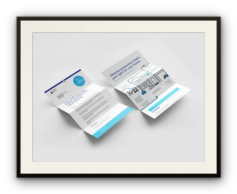
Publipostage prêt à imprimer et courriels de bureau, produits selon les spécifications d’une marque nationale réglementée, aux côtés de son équipe de création.

Les documents d’Allstate rejoignent les assurés à grande échelle et portent avec eux la responsabilité de la marque — la rigueur de production n’est donc pas négociable. Au sein de l’équipe de création d’Allstate, le rôle était axé sur la production : construire selon les devis, préparer pour la presse, et garantir que chaque fichier traverse la chaîne sans révision.

C’est un travail qui ne récompense pas l’improvisation. Valeurs de couleur, fonds perdus, zones de sécurité, rendu courriel — chaque contrainte est fixée par le client, l’imprimeur ou la boîte de réception. L’exécution, c’est le travail.

Résultat

Un ensemble de publipostages et de courriels livré sur plusieurs campagnes aux normes d’Allstate — exact, conforme, prêt.

Rôle — Conception & production

recto · English

Print Production · Direct Mail · Email

Press-ready direct mail and desktop email, built to a regulated national brand’s specifications alongside its creative team.

Allstate’s materials reach policyholders at scale and carry the brand’s accountability with them, which makes production rigour non-negotiable. Working alongside Allstate’s creative team, the role was production-focused: build to spec, prepare for press, and make sure every file could move through the pipeline without revision.

This is the kind of work that doesn’t reward improvisation. Colour values, bleed, safe zones, email rendering — each constraint is fixed by the client, the printer, or the inbox. Execution is the work.

Outcome

A body of direct-mail and email assets delivered across multiple campaigns to Allstate’s standards — accurate, on-spec, and ready.

Role — Design & production

Allstate · 9

Thomas Peng — Œuvres choisies

Selected Work — HearingLife

04 · 07

HearingLife

HearingLife · Email Modernization
pl. 4 — HearingLife · Email Modernizationpl. 4 — HearingLife · Modernisation courriel

verso · français

Design courriel · Marque

Un seul envoi, redessiné — nouvelle hiérarchie, une action claire, et un chemin plus lisible vers un public plus jeune.

HearingLife est un fournisseur canadien de santé auditive établi de longue date, dont le programme courriel avait dérivé, avec le temps, vers les habitudes d’un public plus âgé : mises en page denses, priorités concurrentes, un ton misant sur la familiarité plutôt que sur l’invitation.

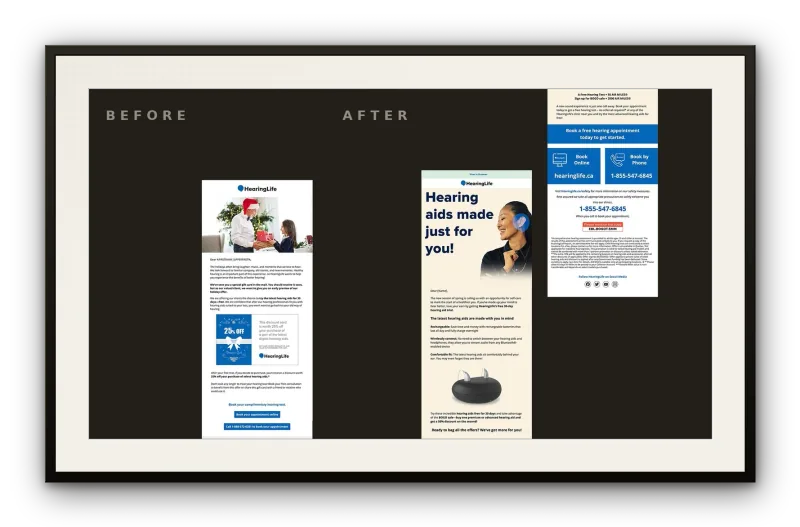
Le mandat était volontairement étroit — moderniser la voix et le format du courriel pour un public plus jeune, sans sacrifier l’autorité de la marque. La réponse, tout aussi ciblée : la refonte documentée, avant-après, d’un envoi central.

Résultat

Une direction prête pour la production — une modernisation sobre et documentée, montrant comment le courriel de HearingLife pouvait rejoindre un public élargi sans perdre son autorité.

Rôle — Conception & production

recto · English

Email Design · Brand

A single eblast, redrawn — new hierarchy, one clear action, and a more legible path to a younger audience.

HearingLife is a long-established Canadian hearing-health provider whose email programme had, over time, drifted toward the habits of an older audience: dense layouts, competing priorities, and a tone that leaned on familiarity rather than invitation.

The brief was deliberately narrow — modernize the email’s voice and format for a younger demographic without surrendering the brand’s authority. The response was equally focused: a single, documented before-and-after redesign of a core eblast.

Outcome

A production-ready direction — a documented, restrained modernization showing how HearingLife’s email could reach a broader audience while holding its authority.

Role — Design & production

HearingLife · 11

Thomas Peng — Œuvres choisies

Selected Work — Cyberus Systems

05 · 07

Cyberus Systems

Cyberus Systems · Brand Identity
pl. 5 — Cyberus Systems · Brand Identitypl. 5 — Cyberus Systems · Identité de marque
#100C3A #1B1464 #928EB5 #F4F0E9

verso · français

Identité de marque

Trois formes superposées en marine profond — un symbole qui se lit à la fois comme signal et comme structure.

Cyberus Systems est une entreprise de cybersécurité, et son identité devait tenir deux idées à la fois — la protection, et le mouvement constant des données. Le symbole répond par trois bandes en chevron empilées, chacune décalée de la précédente, posées contre un logotype géométrique net : le symbole fait le travail expressif, la typographie l’ancre avec un poids institutionnel.

Le nom fond le numérique (cyber) dans le gardien mythologique (Cerbère), et la forme suit — les bandes superposées se lisent à la fois comme ondes de signal, couches de réseau ou boucliers en mouvement. Pour une marque de sécurité, la lisibilité est le propos : le symbole signale la vigilance et la profondeur technique sans retomber sur les cadenas et les clichés du genre.

Résultat

Un symbole assez retenu pour ancrer une identité plus large — techniquement rigoureux sans perdre son tranchant.

Rôle — Conception & production

recto · English

Brand Identity

Three layered forms in deep navy — a mark that reads as both signal and structure.

Cyberus Systems is a cyber-security company, and its identity had to hold two ideas at once — protection, and the constant movement of data. The mark answers with a stacked symbol of three chevron-like bands, each offset from the last, set against a clean geometric wordmark: the symbol does the expressive work, the type grounds it with institutional weight.

The name folds the digital (cyber) into the mythological guardian (Cerberus), and the form follows — the layered bands read at once as signal waves, network layers, or shields in motion. For a security brand, legibility is the point: the mark signals vigilance and technical depth without falling back on padlocks or the usual clichés.

Outcome

A mark restrained enough to anchor a wider identity — technically rigorous without losing its edge.

Role — Design & production

Cyberus Systems · 13

Thomas Peng — Œuvres choisies

Selected Work — Jotted

06 · 07

Jotted

Jotted · Brand Identity
pl. 6 — Jotted · Brand Identitypl. 6 — Jotted · Identité de marque
#8D4016 #F36E26 #F9B997 #F4F0E9

verso · français

Identité de marque

Un gribouillis rendu délibéré — l’énergie d’une pensée saisie en plein vol.

Jotted est une marque de carnets et de papeterie, et son logotype devait ressembler à ce qu’elle vend : le moment où une pensée se couche sur le papier. Il tient deux gestes dans un même souffle — un tracé libre, en spirale, qui se lit comme une écriture en mouvement, et un logotype arrondi et net qui l’ancre. Le point final transforme une note fugace en chose gardée.

Pour une marque de papeterie, le symbole mérite sa place en parlant de l’acte d’écrire plutôt que du produit. Le tracé est inachevé à dessein — une cascade de boucles qui attrapent la pensée avant qu’elle ne se pose — tandis que le logotype reste posé et sûr. Ensemble, ils parcourent l’arc entier d’une idée, de l’impulsion à la trace : précisément la raison d’être d’un carnet.

Résultat

Un symbole qui capte le moment privé de la notation — confiant, chaleureux, et résolument sien.

Rôle — Conception & production

recto · English

Brand Identity

A scribble made deliberate — the energy of a thought caught mid-flight.

Jotted is a notebook and stationery brand, and its logotype had to feel like the thing it sells: the moment a thought gets written down. It holds two gestures in one breath — a loose, spiralling mark that reads as handwriting in motion, and a clean rounded wordmark that grounds it. The terminal period turns a fleeting note into something kept.

For a stationery brand, the mark earns its place by being about the act of writing rather than the product. The symbol is unfinished by design — a cascade of looping strokes that catch a thought before it settles — while the wordmark stays composed and assured. Together they run the whole arc of an idea, from impulse to record, which is exactly what a notebook is for.

Outcome

A mark that captures the private moment of notation — confident, warm, and unmistakably its own.

Role — Design & production

Jotted · 15

Thomas Peng — Œuvres choisies

Selected Work — soomoo

07 · 07

soomoo

soomoo · Brand Identity
pl. 7 — soomoo · Brand Identitypl. 7 — soomoo · Identité de marque
#242851 #3E458C #A2A6C8 #F4F0E9

verso · français

Identité de marque

Un symbole dont la douceur est l’argument.

soomoo est une marque d’articles à boire — tasses à thé et gobelets — et son identité repose entièrement sur une logique ronde et tactile, celle d’une tasse posée dans la main. L’icône est un ovale ouvert, légèrement irrégulier, au contre-poinçon entaillé : à la fois récipient, visage et glyphe. Associé à un logotype en bas de casse dans une linéale géométrique, le système se lit chaleureux et accessible sans verser dans le mignon.

Le double « oo » au centre du nom fait partie du design — les lettres reprennent la grammaire circulaire du symbole, et le bas de casse évite à la marque de revendiquer une autorité qu’elle ne veut pas. Pour un objet qu’on tient en ralentissant, la retenue est le propos.

Résultat

Un symbole qui garde son caractère à toutes les échelles — intime en petite reproduction, assuré en grand format.

Rôle — Conception & production

recto · English

Brand Identity

A mark whose softness is its argument.

soomoo is a drinkware brand — tea cups and tumblers — and its identity leans entirely on rounded, tactile logic, the way a cup sits in the hand. The icon is an open, slightly irregular oval with a notched interior: at once a vessel, a face, and a glyph. Paired with a lowercase wordmark in a geometric sans, the system reads warm and approachable without tipping into cute.

The doubled ‘oo’ at the centre of the name is part of the design — the letterforms echo the symbol’s circular grammar, and the lowercase keeps the brand from claiming an authority it doesn’t want. For something you hold while you slow down, restraint is the point.

Outcome

A mark that holds its character at any scale — intimate in small reproduction, assured at display size.

Role — Design & production

soomoo · 17

Thomas Peng — Œuvres choisies

Selected Work — About

— · —

About · À propos

verso · français

À propos

Thomas Peng est un designer multidisciplinaire établi à Toronto, fort de quinze ans de pratique en identité de marque, emballage, imprimé, web et direction artistique. Il travaille en anglais et en français, pour des clients allant des marques de consommation émergentes aux institutions nationales établies.

Le travail circule entre des extrêmes d’échelle : un logo résolu à quelques points près, un système d’emballage complet, un programme d’impression à haut volume tenu aux spécifications d’une marque nationale. Ce qui demeure, c’est la disposition — trouver la forme juste pour le problème, puis l’exécuter à un niveau qui survit au contact de la production.

Établi à
Toronto, Canada
Langues
English / Français
Pratique
Marque · Emballage · Imprimé · Web
Contact
thomas@thomaspeng.ca

Willo · BMW · Allstate · HearingLife

recto · English

About

Thomas Peng is a multidisciplinary designer based in Toronto, with fifteen years of practice across brand identity, packaging, print, web, and art direction. He works in English and French, for clients that range from emerging consumer brands to established national institutions.

The work moves between extremes of scale: a logo resolved at a few points, a full packaging system, a high-volume print programme held to a national brand’s specification. What stays constant is the disposition — find the right form for the problem, then execute it to a standard that survives contact with production.

Based in
Toronto, Canada
Languages
English / Français
Practice
Brand · Packaging · Print · Web
Contact
thomas@thomaspeng.ca

Willo · BMW · Allstate · HearingLife

Faisons quelque chose qui mérite d’être gardé.

Marque, emballage, imprimé et web — du simple symbole au système complet. Si le mandat est défini et le standard élevé, j’aimerais en entendre parler.

Let’s make something worth keeping.

Brand, packaging, print, and web — from a single mark to a full system. If the brief is defined and the standard is high, I’d like to hear about it.

thomas@thomaspeng.ca

Open to new projectsOuvert aux nouveaux projets

7 works · Toronto · EN / FR7 œuvres · Toronto · FR / EN

About · 19